Experience
Reservations >
Adults
Children
Children


Welcome
to Our Village
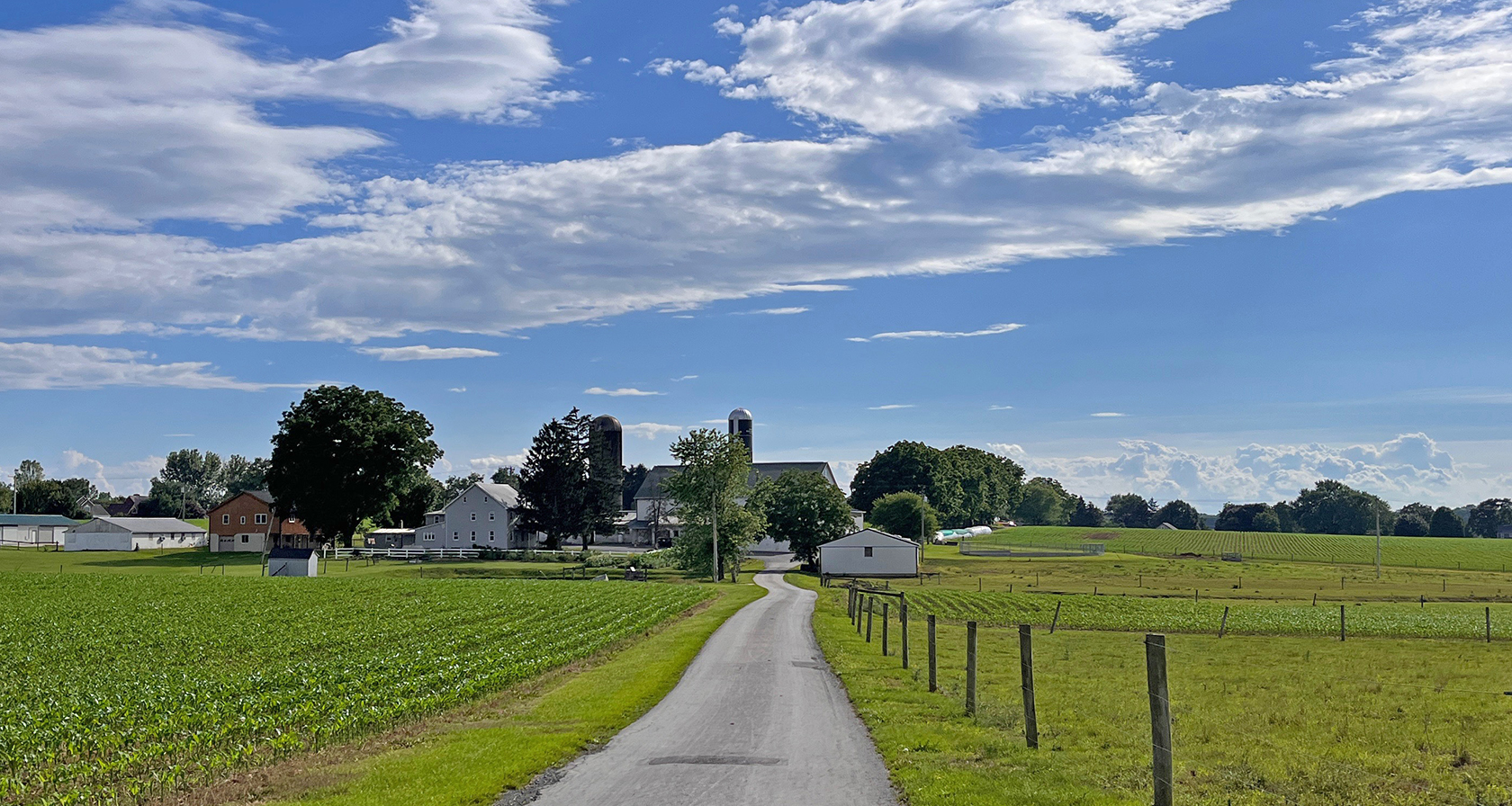
Everything You Love About Lancaster County All in One Place
Stay, dine, shop, and experience authentic Amish Country in our family-owned village that has been welcoming guests for over 100 years.
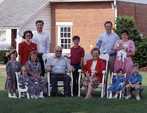
Bird-in-Hand has been a haven for travelers since Colonial times, when they built the road between Philadelphia and Lancaster. The Smucker family has carried on that tradition for generations. Today we extend our personal welcome and invite you to get to know the village we call “home” in the heart of Lancaster County, PA’s Amish Country.
Stay
Someplace
Worth Remembering
Someplace
Worth Remembering
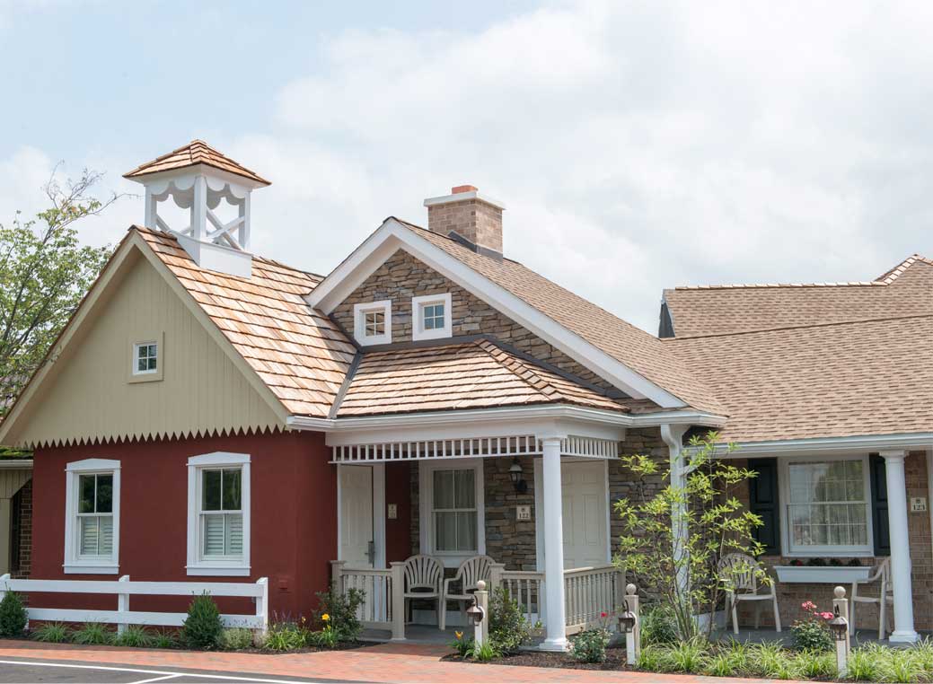
Unique Lancaster County Lodging
Spend the night in a replica of an Amish schoolhouse. Or in a romantic suite in our original 18th-century inn. Whether you are planning a relaxing weekend escape or a memory-filled family trip, our Bird-in-Hand family of properties has something to offer everyone – and all our inns and motels give you easy access to the most popular Lancaster County attractions. Find out why so many of Bird-in-Hand’s Guests return year after year.
Have
Experiences
Worth Talking About
Experiences
Worth Talking About
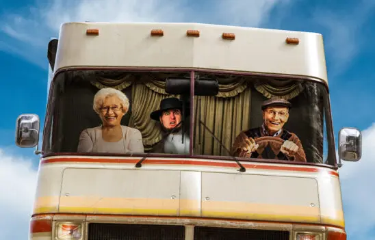
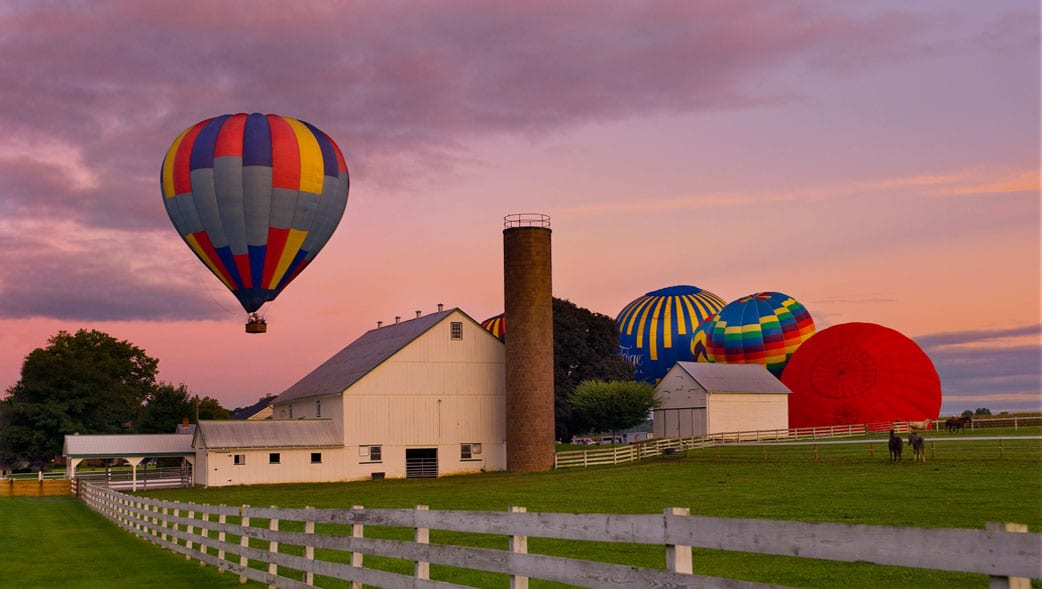
A Vacation Like No Other
An insider’s back-road tour of Amish Country. A hot air balloon ride over the farmlands. A summer cookout in a cornfield. S’mores around the firepit under the stars. Listening to the clip-clop of horses’ hooves as the buggies go by. Watching the kids get breakfast from a buffet built like Noah’s Ark.
We could go on – but you should experience it all for yourself! For a list of places to dine, shop, and stay, plus special events and things to do in Bird-in-Hand during your visit, check out the Bird-in-Hand Village Map & Guide.
Featured Packages, Experiences & Events
View Details
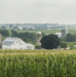
Amish Farmland Tour 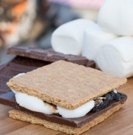
View Details
Fireside S’mores Package 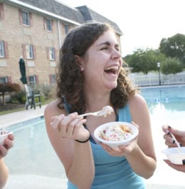
View Details
Smucker Ice Cream Socials 
View Details
Harvest Tour